
Who amongst us has not looked something up using their mobile phone, iPad, iPod Touch or some other mobile device? I think there are few that would be raising their hand on that one.
The fact is that mobile access to the internet has become a given in most of our lives. With the ability to check where we are going, what services are nearby, how much something costs somewhere else, the internet has permeated into every facet of our life at home, work and on the go.
For this reason it has become extremely important to make sure us business owners are checking that we are optimised for however people may find us. In times past we just had to keep a tidy shopfront….now the web is as much a shopfront as the one in the real world.
People judge our business by how we appear on the net. Mobile browsing is growing strong with studies predicting that by 2015, mobile browsing is going to overtake normal desktop browsing of the internet. So do something right now and look up your website on your mobile phone.
Here is what you studies have determined people browsing the internet using a mobile device expect of your website:
Your website should load fast
- 3g/4g networks are not the most stable, reliable or quick internet connection and users don’t want to have to reload your site after waiting 10 seconds
- People have a data allowance so don’t want to be wasting it loading your single website
Your website should be easy to read
The average mobile phone screen size is 320 pixels by 480 pixels whereas computer screens are now upwards of 1024 pixels by 768 pixels….commonly a mobile phone screen is 1/5th the size so how does your text look at 1/5th the font size?
Your website should be easy to navigate
- Navigation menu items need to be clear.
- Furthermore, they need to be large enough to press….. I often find myself pressing the menu item next to the one I intended.
Your website should require minimal scrolling
Not just vertically, but also horizontally
[col type=”lts-one-half”]
Your website should avoid the use of flash
All Apple mobile devices do not, and never will, support flash.
The graph to the right shows the default web browser on Apple devices, Safari, is the dominant browser type, hence Apple devices are clearly something your website must be optimised for.
[/col][col type=”lts-one-half lts-col-last”] [/col]
So how did you go?
The truth is few websites pass the test. Obviously, if it were to look 100% on your mobile it would not have much visual impact on the larger screen of a desktop computer or laptop.
The real solution is to utilise responsive website design. This is where the website has been coded with breakpoints set based on the width of common devices used for browsing the internet such that a website can be viewed without the need for magnifying and scrolling across the page.
Huh?? Here it is in picture form….
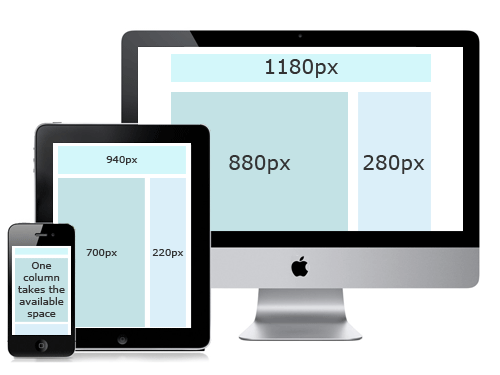
….and if you are on a desktop you can resize your browser window while viewing this page to see how this website adjusts to the width of an iPad or iPhone.
If you would like to know more about responsive websites and how The Adviser Brand can apply it in your business then contact The Adviser Brand to see how we can get started with a responsive website.
Related Posts


